
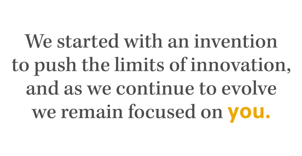
Let us introduce our new vision for ALUCOBOND®.
In 1969, we invented Aluminum Composite Material, and we’ve been leading the world in design innovation and manufacturing excellence ever since. To help our clients build the future, we remain focused on inspiring the architectural community to create their legacy with the next generation of buildings and push the limits of design. As we build upon our brand identity we are expanding our focus with trend forward thinking to enhance our product and finish offering. Our relationships within the architectural community have provided us with a clear pulse to what’s important and what we need to better serve our customers. We invite you to join us on our journey and discover the first step to our rebrand.
We’re Listening
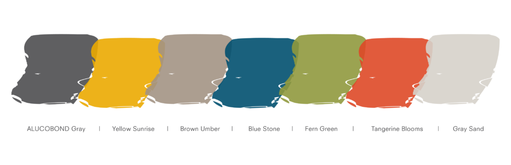
Biophilic design conceptualizes spaces in a way that acknowledges the human need to connect with nature; our new brand color palette exemplifies our unique approach to the market. Maintaining the well-known ALUCOBOND Gray in our brand refresh was important to support our global presence. To signify the growth and opportunities ahead, we added balanced neutral earth tones and naturally occurring vibrant hues !
Color Palette

We’re Looking
It is very rewarding to see the immensely innovative ideas that materialize with ALUCOBOND PLUS. Our new tagline “Giving Shape to Great Ideas” encourages bold vision and ingenuity. Working with our existing logo, we’ve incorporated PLUS and AXCENT to provide clarity about our product offerings while reinforcing the new primary brand colors.
Logo & Tagline
We’re Making Our Mark
While ALUCOBOND has a rich history, we are also focused on what comes next. Our brand mark represents an iconic brand but also exemplifies the future of the architectural industry. Our brand mark aims to convey strength and character with the use of ALUCOBOND’s A, and suggests an organic and fluid approach with the use of abstraction, transparency and gradation. The linear graphics incorporated into our brand are meant to stimulate new concepts and push the boundaries of design.
Brand Mark & Graphics

We’re Building on Tradition
The blend of classical and modern typography speaks to our motivations for a brand refresh. As we continue to grow we remain conscious of changing needs in the industry. Kepler Medium is a contemporary serif typeface that captures old style in a humanistic manner, and contrasts well to the modern San-serif typeface Neuzeit S.
Typography

ALUCOBOND’s rebrand is the first step in our goal to better serve the architectural community by emphasizing clarity, modernity and receptiveness to a transforming industry. We are thrilled to officially launch our rebrand and aspire to support bold thinking for beautiful environments to come.
Yours Truly,
3A Composites USA,
Manufacturers of ALUCOBOND® PLUS